Your homepage is the lobby. Don’t make them wait
Too many industrial homepages operate like a digital museum. They proudly display a picture of the founder from 1998, a vague corporate mission statement about quality, and a static photo of the factory gates.
Nobody cares. Buyers are exceptionally selfish. They want to know what you can do for them, and they want to know it in five seconds.
Shift from Displaying to Selling
A displaying homepage says: “We are ABC Manufacturing. We were founded in 2005. We make parts.”
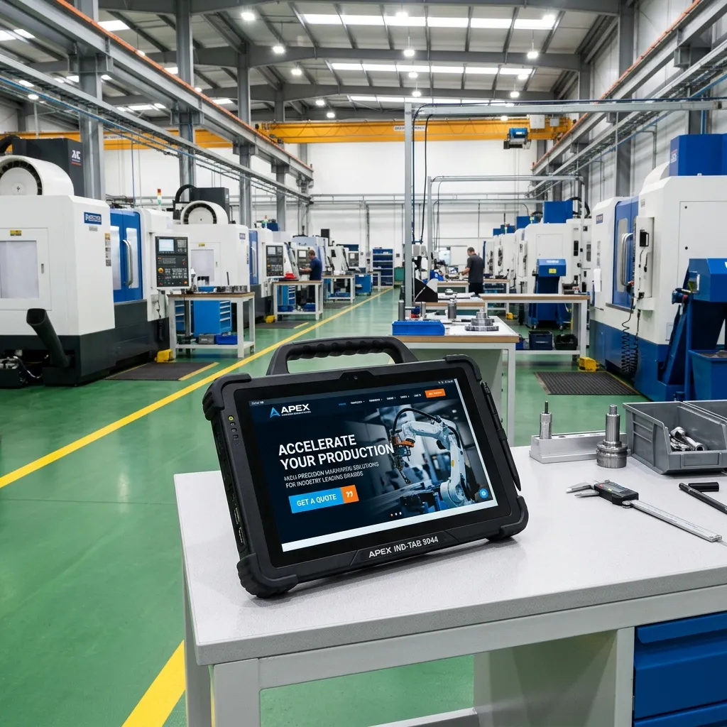
A selling homepage says: “High-volume Aluminum Die Casting for the European Automotive Sector. ISO-9001 Certified. Shipping directly from our 50,000 sqm facility in Shenzhen.”
The difference is active positioning. The selling homepage instantly disqualifies bad fits and highly qualifies target buyers. It doesn’t waste space on corporate philosophy. It immediately directs the buyer to the specific division they need—whether that’s tooling, mass production, or QA documentation.
The Hero Section Dictates the Outcome
Your above-the-fold content decides everything. The headline must state exactly what you do. The subheadline must state who you do it for and why you’re better. The button must offer a clear next step (e.g., “Review Our Capabilities” rather than “Learn More”). Get the homepage right, and the rest of the site falls into line.